


Great visuals, but not the easiest to navigate.
Submitted 10 years ago
Community Review for Gapminder
My Take
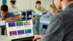
Gapminder focuses on the past 200 years of development across the world. It shows the life expectancy, GDP, and other shifts. There are blog posts, videos, downloads, and a number of "how-to"s to help users along the way. It provides statistical data that would work great in a current events or world history class, but also could be used meaningfully in statistics or other math classes.
How I Use It
Gap minder is a visual way to present a number of global trends over the past 200 years. The graphs are helpful, and you can highlight specific countries. The site is not easy to navigate, though. It might seem at first that there's only one available graph to investigate, when in reality there are many.
More community reviews for Gapminder
Mohamed O.
Teacher
September 21, 2016
This tool is affecting positively the students' learning.
This is an excellent tool as it helped my students understand better in class as well as at home. It is also interesting as it empowered my students with live information. I used this tool at the beginning of the session to help students get information and use them for a writing task.
I think it is good, but some students need more time to understand it.
Continue reading
1 person found this helpful.
Jarrad S.
Teacher
December 12, 2015
Connect Maths and Social Studies by using real UN data to explore graphing, statistics and data.
Incredibly fast and reliable site for large data sets which will interest students with an interest in travel, politics or global citizenship. Student can get lost in the plethora of information, but I suggest letting them get a little lost so they understand the complexities of the world we live in.
Continue reading
James Denby
Educator/Curriculum Developer
November 14, 2015
Serious potential for students to find real data to support opinions on global issues
The information presented in GapMinder is not simple. If you take the time to help students learn to use the site and to understand the meaning of real data, you will be doing them several favours.
1. You will teach them how to understand data and infographics.
2. You will help them find concrete evidence to support points of view on serious global issues.
3. You will support their development of real research techniques.
It's been worth it in my classroom.
Continue reading